A polar diagram is a graphic presentation of a sailboat’s sailing performance in various wind conditions. But how do you interpret it?
The same information is also often presented in the form of a table or spreadsheet, which is how the data are originally collected or computed, which in turn is then plotted on a polar diagram as shown below. Programs that compute this data are called velocity prediction programs (VPP).

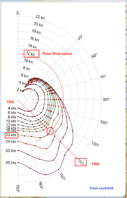
This is a polar diagram from a specific Farr40 as it appears graphically in LuckGrib above, which includes multiple polar diagrams in its routing function, plus the option to import custom versions.
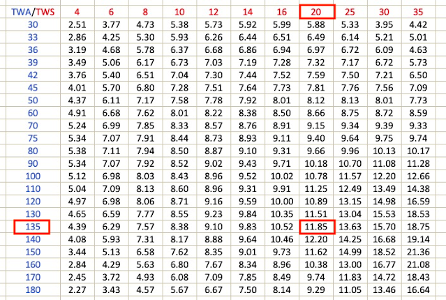
Below are the same data in table format. Here we learn that this Farr40 sailing in a true wind speed (TWS) of 20 kts at a true wind angle (TWA) of 135º should in principle have a boat speed of 11.85 kts. We can read this from the diagram, but get more precise readings from the table. As discussed below, these are theoretical or target speeds based on yacht design. It is up to the navigator to determine if these are realistic values or do they need to be modified to match actual performance.

Continue reading at DavidBurchNavigation.blogspot.com and see a video tutorial below.
David Burch
David Burch is the owner and courses director of the Starpath School of Navigation. An author and authority on weather and navigation, he has more than 70,000 miles of ocean experience ranging from the Arctic ice edge to Tahiti and Australia in the Pacific and from New York to Panama in the Atlantic.


